Introduction
Charts help convert Excel data into visual information that is easier to understand and compare. In this chapter, you will practice Column Charts, Bar Charts, and Line Charts using different types of datasets. The questions cover basic chart creation, category comparison, monthly trends, multiple series, sorting data before creating charts, and practical business reports. Column, Bar and Line Chart Practice Questions with Solutions to help you understand the concepts.
Note: The chart questions are designed for practice. The data is intentionally simple so beginners can focus on understanding which chart type is suitable for each situation.
Question 1: Create a Column Chart for Monthly Sales
Problem Statement
Create a Column Chart to compare monthly sales.
Excel Data
| Month | Sales |
|---|---|
| January | 45000 |
| February | 52000 |
| March | 48000 |
| April | 61000 |
| May | 68000 |
| June | 75000 |
Excel Solution
- Select the complete data range A1:B7.
- Go to Insert.
- Select Column or Bar Chart.
- Choose 2-D Column → Clustered Column.
- Give the chart the title Monthly Sales.
Expected Result
The chart should display:
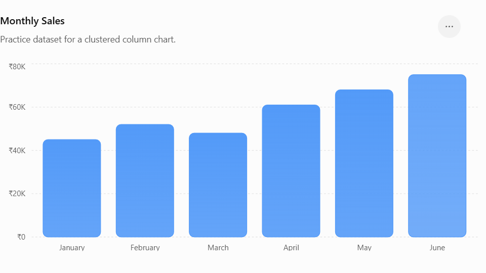
- Months on the horizontal axis.
- Sales values on the vertical axis.
- One column for each month.
Concepts Covered
- Column Chart
- Clustered Column
- Category axis
- Value axis
- Chart title
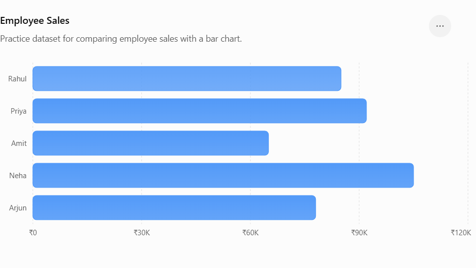
Question 2: Create a Bar Chart for Employee Sales
Problem Statement
Create a Bar Chart to compare sales made by different employees.
Excel Data
| Employee | Sales |
|---|---|
| Rahul | 85000 |
| Priya | 92000 |
| Amit | 65000 |
| Neha | 105000 |
| Arjun | 78000 |
Excel Solution
Create a 2-D Clustered Bar Chart using the employee and sales columns.
Expected Result
The employee names should appear on the vertical axis, with horizontal bars representing their sales.
Concepts Covered
- Bar Chart
- Horizontal comparison
- Employee-wise analysis
- Category comparison
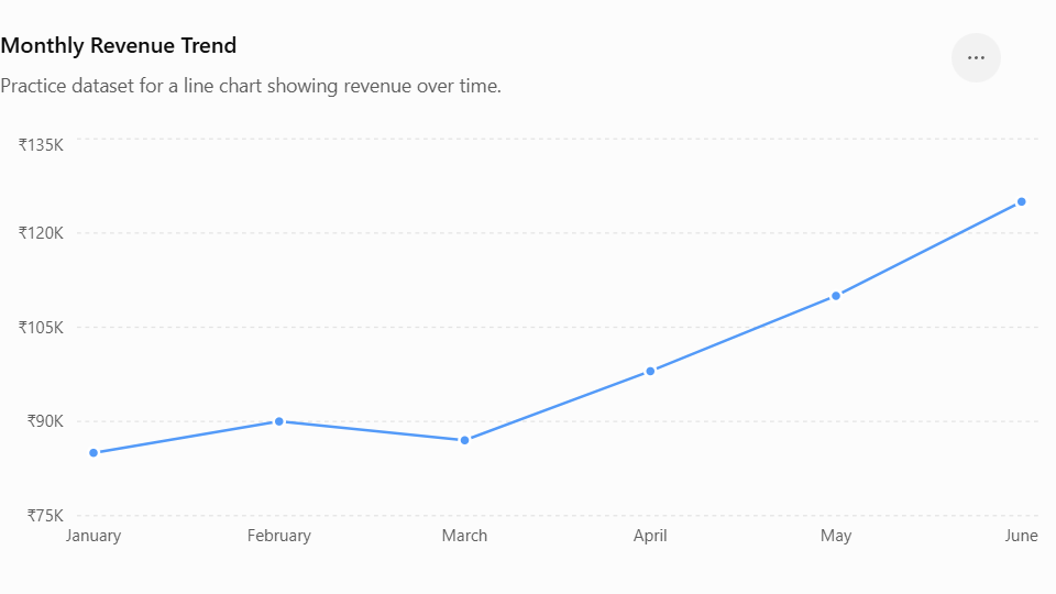
Question 3: Create a Line Chart for Monthly Revenue
Problem Statement
Create a Line Chart to show how revenue changes over six months.
Excel Data
| Month | Revenue |
|---|---|
| January | 85000 |
| February | 90000 |
| March | 87000 |
| April | 98000 |
| May | 110000 |
| June | 125000 |
Excel Solution
Create a 2-D Line Chart using the Month and Revenue columns.
Expected Result
The line should connect the monthly revenue values and make the overall trend easy to identify.
Concepts Covered
- Line Chart
- Time-based data
- Trend analysis
- Data points
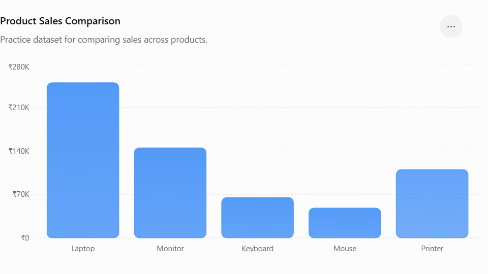
Question 4: Compare Sales of Multiple Products
Problem Statement
Create a Column Chart comparing sales of different products.
Excel Data
| Product | Sales |
|---|---|
| Laptop | 250000 |
| Monitor | 145000 |
| Keyboard | 65000 |
| Mouse | 48000 |
| Printer | 110000 |
Excel Solution
Select the data and insert:
Insert → Column or Bar Chart → Clustered Column
Expected Result
Each product should have its own column.
Concepts Covered
- Column Chart
- Product comparison
- Categorical data
- Chart formatting
Question 5: Create a Line Chart With Two Data Series
Problem Statement
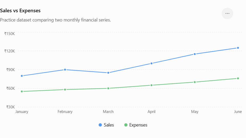
Create a Line Chart comparing Sales and Expenses over six months.
Excel Data
| Month | Sales | Expenses |
|---|---|---|
| January | 80000 | 55000 |
| February | 90000 | 58000 |
| March | 85000 | 60000 |
| April | 100000 | 65000 |
| May | 115000 | 70000 |
| June | 125000 | 76000 |
Excel Solution
Select A1:C7 and insert a Line Chart.
Excel should automatically create two lines:
- Sales
- Expenses
Expected Result
Concepts Covered
- Multiple data series
- Line Chart
- Legend
- Trend comparison
Question 6: Create a Bar Chart for Department-Wise Employees
Problem Statement
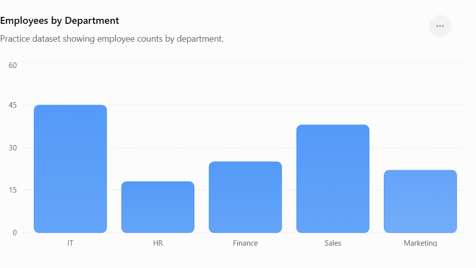
Create a Bar Chart showing the number of employees in each department.
Excel Data
| Department | Employees |
|---|---|
| IT | 45 |
| HR | 18 |
| Finance | 25 |
| Sales | 38 |
| Marketing | 22 |
Excel Solution
Select the dataset and create:
Insert → Bar Chart → Clustered Bar
Expected Result
Concepts Covered
- Bar Chart
- Employee count
- Department comparison
- Category labels
Question 7: Create a Monthly Website Visitors Line Chart
Problem Statement
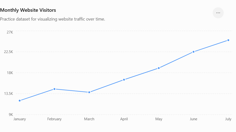
Create a Line Chart to show the number of website visitors over seven months.
Excel Data
| Month | Visitors |
|---|---|
| January | 12000 |
| February | 14500 |
| March | 13800 |
| April | 16500 |
| May | 19000 |
| June | 22500 |
| July | 25000 |
Excel Solution
Create a Line Chart using Month and Visitors.
Expected Result
Concepts Covered
- Line Chart
- Website traffic
- Time-series data
- Trend visualization
Question 8: Create a Column Chart for Quarterly Sales
Problem Statement
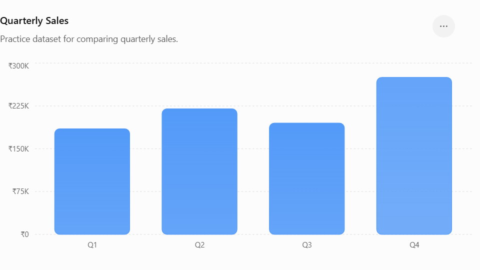
Create a Column Chart comparing sales for four quarters.
Excel Data
| Quarter | Sales |
|---|---|
| Q1 | 185000 |
| Q2 | 220000 |
| Q3 | 195000 |
| Q4 | 275000 |
Excel Solution
Create a Clustered Column Chart using Quarter and Sales.
Expected Result
Concepts Covered
- Column Chart
- Quarterly data
- Business reporting
- Period comparison
Question 9: Sort Data Before Creating a Column Chart
Problem Statement
You have product sales data. Sort the products from highest sales to lowest sales and then create a Column Chart.
Excel Data
| Product | Sales |
|---|---|
| Keyboard | 65000 |
| Laptop | 250000 |
| Mouse | 48000 |
| Monitor | 145000 |
| Printer | 110000 |
Excel Solution
First sort the dataset by Sales from Largest to Smallest.
Expected sorted data:
| Product | Sales |
|---|---|
| Laptop | 250000 |
| Monitor | 145000 |
| Printer | 110000 |
| Keyboard | 65000 |
| Mouse | 48000 |
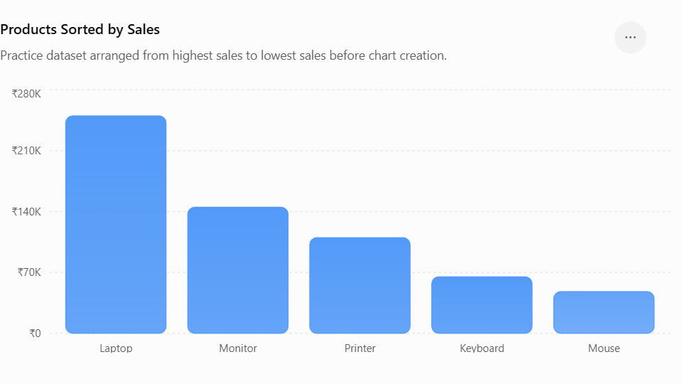
Then create a Clustered Column Chart.
Concepts Covered
- Sorting data
- Column Chart
- Largest-to-smallest analysis
- Chart preparation
Question 10: Create a Complete Sales Performance Chart
Problem Statement
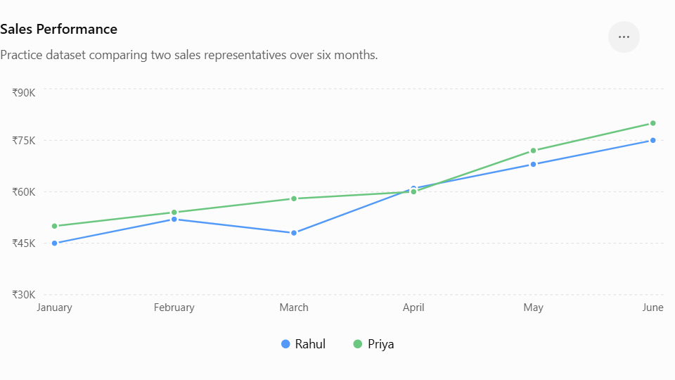
Create a Line Chart showing monthly performance for two sales representatives.
Excel Data
| Month | Rahul | Priya |
|---|---|---|
| January | 45000 | 50000 |
| February | 52000 | 54000 |
| March | 48000 | 58000 |
| April | 61000 | 60000 |
| May | 68000 | 72000 |
| June | 75000 | 80000 |
Excel Solution
- Select A1:C7.
- Go to Insert.
- Select Line Chart.
- Choose a standard 2-D Line chart.
- Add the chart title Sales Performance.
- Check that the legend identifies Rahul and Priya correctly.
Expected Result
Concepts Covered
- Line Chart
- Multiple series
- Sales comparison
- Legend
- Monthly trend analysis
Key Takeaways
- Column Charts are useful for comparing values across categories.
- Bar Charts are useful when category names are long or when horizontal comparison is easier.
- Line Charts are useful for showing trends over time.
- A chart should be selected according to the type of data being analyzed.
- Multiple series can be displayed in one chart for comparison.
- Sorting data before creating a chart can make the visual easier to understand.
- Chart titles should clearly describe what the chart represents.
- Legends help identify multiple data series.
- The horizontal and vertical axes should represent the correct data.
- Charts can make large datasets easier to analyze and present.
FAQs
1. What is a Column Chart in Excel?
A Column Chart displays data using vertical columns. It is commonly used to compare values between categories such as products, departments, months, or regions.
2. When should I use a Bar Chart in excel?
A Bar Chart is useful when you want to compare categories using horizontal bars. It can also be easier to read when category names are long.
3. When should I use a Line Chart in excel?
A Line Chart is commonly used for data that changes over time, such as monthly sales, website visitors, expenses, or revenue.
4. What is the difference between a Column Chart and a Bar Chart?
The main difference is their orientation:
- Column Chart → vertical bars
- Bar Chart → horizontal bars
Both can be used for categorical comparisons.
5. Can I create a chart with multiple data series?
Yes. For example, you can create a Line Chart containing Sales and Expenses or compare the performance of two employees.
6. How do I add a chart in Excel?
Select your data, go to the Insert tab, choose the appropriate chart type, and select the required chart style.
7. Can I change a Column Chart to a Bar Chart?
Yes. Select the chart and use Chart Design → Change Chart Type. You can then select a different chart type.
8. Why is sorting useful before creating a chart?
Sorting can make comparisons easier, particularly when you want to display categories from highest to lowest or lowest to highest.
9. What is a chart legend?
A legend identifies different data series in a chart. It becomes especially useful when a chart contains multiple series.
10. Can Excel charts update when the source data changes?
Yes. When the chart is linked to its source data, changes to the source values can be reflected automatically in the chart.
Written by Shubhranshu Shekhar, who has trained 20000+ students in coding.